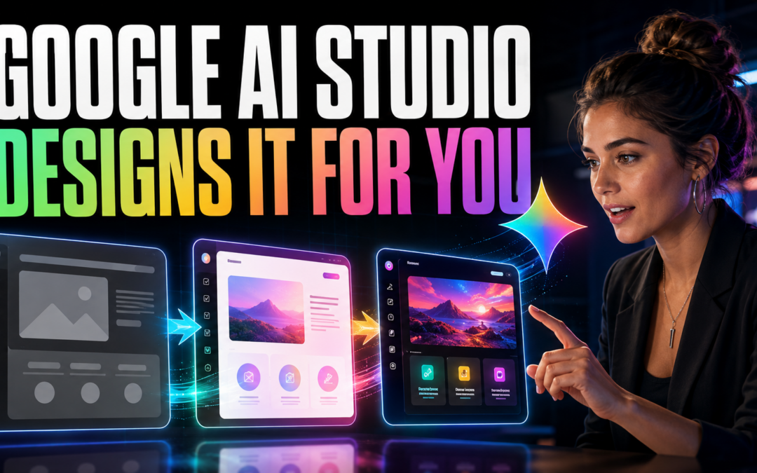
Google AI Studio’s Design Variations: How to Make AI-Built Apps Look and Work Better
Building an app with artificial intelligence is becoming surprisingly easy. Describe an idea, wait a few moments, and a functional interface can appear in your browser.
But there is an important difference between an app that technically works and one that people actually enjoy using.
A generated app may contain the right features while still feeling generic, crowded, confusing, or unfinished. Buttons compete for attention. Information lacks hierarchy. Colors look arbitrary. The result functions like software but does not yet feel like a real product.
Google AI Studio’s Design Variations capability is designed to shorten that awkward middle stage. Instead of repeatedly trying to describe a visual style through prompts, builders can generate multiple interpretations of an existing interface, compare them, and choose the strongest direction.
Google has demonstrated Gemini generating several coded design variations from a single instruction, illustrating how quickly AI can now move from one idea to multiple testable interfaces. Google’s Gemini 3 Flash announcement
NEW Google AI Studio Update is INSANE (FREE!)
What Is Google AI Studio?
Google AI Studio is a browser-based environment for experimenting and building with Gemini models. Its Build mode allows users to describe an application in natural language and generate its code, files, and working preview.
Google’s current platform supports full-stack web applications, including React frontends, Node.js server environments, npm packages, external APIs, and secrets management. Generated code can also be exported for continued development elsewhere.
This makes AI Studio useful for creating:
- Landing pages
- Calculators and assessment tools
- Membership portals
- Internal dashboards
- Resource libraries
- Interactive educational experiences
- Customer onboarding systems
- Early SaaS prototypes
AI Studio dramatically reduces the effort required to produce a working first version. Design Variations helps improve how that version is organized and presented.
Why Describing Design With Words Is Difficult
Prompts such as “make it modern,” “make it premium,” or “give it a clean professional appearance” sound specific to a human but leave enormous room for interpretation.
What does “premium” mean?
It could mean elegant typography and generous spacing. It could also mean dark backgrounds, gold accents, animation, glass effects, or oversized photography. The model must guess which interpretation the builder intended.
This often creates a frustrating cycle:
- Ask for a cleaner design.
- Receive a different but not necessarily better design.
- Write a longer prompt.
- Accidentally lose something that was already working.
- Continue revising without a clear standard for success.
Design Variations changes this from a prompting problem into a selection problem. The AI produces multiple visual directions, while the human evaluates which direction best serves the user.
How Design Variations Helps
The basic workflow is simple:
- Build the first functional version of your app or page.
- Give it real sections, content, buttons, and navigation.
- Generate several design variations.
- Compare the alternatives side by side.
- Select the layout that best supports the page’s purpose.
- Refine individual elements through prompts, visual annotations, or code edits.
- Test the result with actual users.
The feature is most valuable after the basic structure exists. An empty page gives AI very little context. A functioning page with meaningful content gives it something concrete to reorganize and improve.
Think of Design Variations as a rapid creative director. It can propose directions, but it should not make the final decision for you.
Do Not Automatically Choose the Flashiest Option
The most visually dramatic design is not always the most effective.
A resource center should make information easy to scan. An onboarding screen should make the next action obvious. A checkout page should reduce hesitation. A community dashboard should help members understand what has changed and what they can do next.
Before selecting a variation, ask:
- Can users immediately understand the page?
- Is the primary action obvious?
- Does the information follow a logical order?
- Is anything competing unnecessarily for attention?
- Will the layout work on a mobile screen?
- Does the design fit the intended audience?
- Does it feel trustworthy?
- Is it accessible and readable?
A quieter design that helps people complete their task is usually more valuable than a spectacular design that creates friction.
A Better Design-Variation Workflow
1. Define the Page’s Job
Write one sentence explaining what the visitor should accomplish.
For example:
“This page should help a new member select and begin the correct onboarding lesson.”
This becomes the standard against which every variation is judged.
2. Build the Essential Structure
Include the actual headline, navigation, actions, content categories, forms, and other necessary components before experimenting with visual directions.
Do not begin with decorative effects. Begin with what users need.
3. Generate Several Directions
Explore variations with genuinely different priorities:
- Minimal and conversion-focused
- Dense and information-rich
- Friendly and welcoming
- Professional and authoritative
- Energetic and community-oriented
- Mobile-first and action-oriented
The goal is not to find a prettier version of the same idea. It is to discover different ways the experience might work.
4. Score the Results
Evaluate each option from one to five in these areas:
| Criterion | Question |
|---|---|
| Clarity | Can users understand the page immediately? |
| Hierarchy | Are the most important elements emphasized? |
| Usability | Is the desired action easy to complete? |
| Readability | Are text, contrast, and spacing comfortable? |
| Brand fit | Does it feel appropriate for the product? |
| Responsiveness | Does it remain usable on smaller screens? |
This makes the decision more disciplined and less dependent on whichever design initially catches your eye.
5. Refine the Winning Direction
Once you select a strong foundation, improve specific details:
- Simplify navigation
- Strengthen the primary button
- Reduce unnecessary colors
- Improve heading hierarchy
- Standardize spacing
- Clarify form labels
- Add empty, loading, and error states
- Check mobile behavior
- Improve accessibility
Use variations for the broad direction and targeted edits for the finishing work.
6. Test Outcomes, Not Opinions
Whenever possible, measure what users actually do.
For a landing page, track signups. For onboarding, examine completion rates. For a resource hub, measure whether people can find the correct material. For a dashboard, observe which tools are used and where people become confused.
The winning design is not necessarily the one people say they like. It is the one that helps them succeed.
Where AI-Generated Design Can Go Wrong
Design Variations can accelerate exploration, but it does not replace professional judgment.
AI-generated interfaces may still contain:
- Weak accessibility
- Inconsistent components
- Misleading visual hierarchy
- Poor mobile layouts
- Unnecessary animations
- Generic branding
- Confusing navigation
- Incomplete application states
- Security or privacy problems in the underlying app
A polished interface can also create false confidence. Attractive software is not automatically secure, reliable, commercially viable, or ready for production.
Before launching an AI-generated application, review authentication, permissions, data handling, API keys, error recovery, performance, accessibility, and testing. Visual quality is one part of product quality.
The New Skill Is Taste
AI is making software production faster and more accessible. It can create the first interface, generate alternatives, revise components, and write much of the supporting code.
What it cannot fully determine is which experience deserves to exist.
That requires taste: the ability to recognize clarity, eliminate distractions, understand an audience, and choose the design that supports a meaningful outcome.
The competitive advantage is shifting from the ability to produce one interface to the ability to evaluate twenty possibilities intelligently.
AI supplies abundance.
The builder supplies direction.
Final Takeaway
Google AI Studio’s Design Variations can turn hours of vague design prompting into a much faster process of generating, comparing, selecting, and refining.
But its real value is not simply making an app look better. It helps builders explore more possibilities before committing to one direction.
Use AI to create the options. Use user needs, evidence, and human judgment to choose among them.
AI can generate unlimited designs. The valuable skill is knowing which design helps people accomplish what matters.
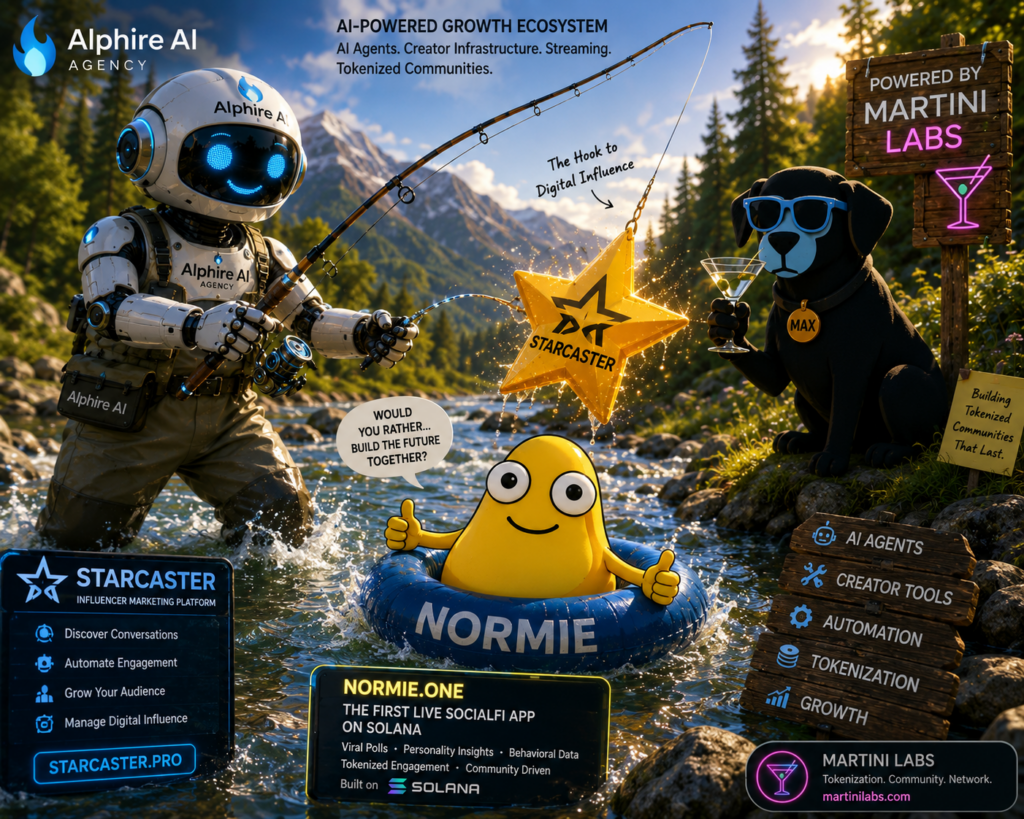
From Attention to Ownership
Starcaster Pro by Alphire AI is the growth engine for the next generation of brands, creators, and tokenized communities.
Starcaster Pro uses AI agents to discover relevant conversations, identify creators, automate personalized engagement, manage campaigns, publish content, and measure growth. But attracting attention is only the beginning.
Normie transforms that attention into participation through viral “Would You Rather?” polls, personality insights, behavioral data, community interaction, and SocialFi rewards.
Martini Labs completes the ecosystem by helping brands tokenize loyalty, reward valuable contributions, raise support, and give communities a meaningful stake in what they help build.
Together, they create a powerful growth flywheel:
Starcaster Pro attracts the audience.
Normie activates the community.
Martini Labs turns engagement into ownership.
Alphire AI automates and connects it all.
This is more than influencer marketing. It is an AI-powered system for turning conversations into communities, communities into ecosystems, and engagement into lasting value.
Discover. Engage. Reward. Own. Grow.